Case Study

Plenty of traffic, but too few completed bookings.
Users were reaching the site, but hesitation, friction, and weak trust signals were getting in the way of conversion.
A travel ecommerce case study focused on trust, booking friction, and conversion improvement across key journeys.
Client
Holiday Gems
Sector
Travel
Role
UX Engagement
Services
UX, User Research, CRO, Accessibility, Heuristic Analysis
Project overview
High traffic. Low conversion.
Holiday Gems had built strong glossaryTrafficTraffic refers to the number of users visiting a website, app, or digital product over a given period.Open glossary term through glossarySEO (Search Engine Optimisation)SEO is the process of improving a website’s visibility in search engines like Google through content, structure, and technical optimisation.Open glossary term, but glossaryConversion RateConversion rate is the percentage of users who complete a desired action compared to the total number of users.Open glossary term weren’t where they needed to be.
Users were browsing, comparing and dropping off before completing a booking.
In a highly competitive travel market, that gap between glossaryTrafficTraffic refers to the number of users visiting a website, app, or digital product over a given period.Open glossary term and glossaryConversionA conversion is any action a user takes that aligns with a defined goal, such as making a purchase, signing up, or completing a task.Open glossary term is where revenue is lost.
The challenge was clear. Understand where users were struggling, why they weren’t converting, and what needed to change to turn glossarySearch IntentSearch intent is the underlying goal or purpose behind a user’s query, such as finding information, making a purchase, or navigating to a specific site.Open glossary term into bookings.
What was happening
Users were doing the work the product should have been doing.
The booking journey wasn’t supporting decision-making.
Key information was either missing, hard to find, or introduced too late. Users were forced to glossarySearchSearch is the functionality that allows users to find content or information by entering queries. It relies on indexing, metadata, and relevance algorithms to return useful results.Open glossary term, compare and validate details themselves, often leaving the site to do so.
Pricing was a major issue. Costs increased later in the journey, creating uncertainty and breaking glossaryTrustUser confidence that a product, service, or organisation will do what it promises.Open glossary term.
glossaryNavigationHow users move around a website or product.Open glossary term added glossaryFrictionFriction refers to anything that slows users down or makes it harder for them to complete a task. It can be caused by poor design, unnecessary steps, unclear messaging, or technical issues.Open glossary term. Important details like baggage, flight carriers and flexibility options weren’t clear when users needed them.
Visually, pages were dense and cluttered. Important actions were easy to miss, and users hesitated rather than progressing.
The result was predictable. Users dropped off, not because they didn’t want to book, but because they didn’t feel confident enough to do so.
Approach
Understand real behaviour, not assumptions.
The focus was on building a clear, evidence-based understanding of where and why users were struggling.
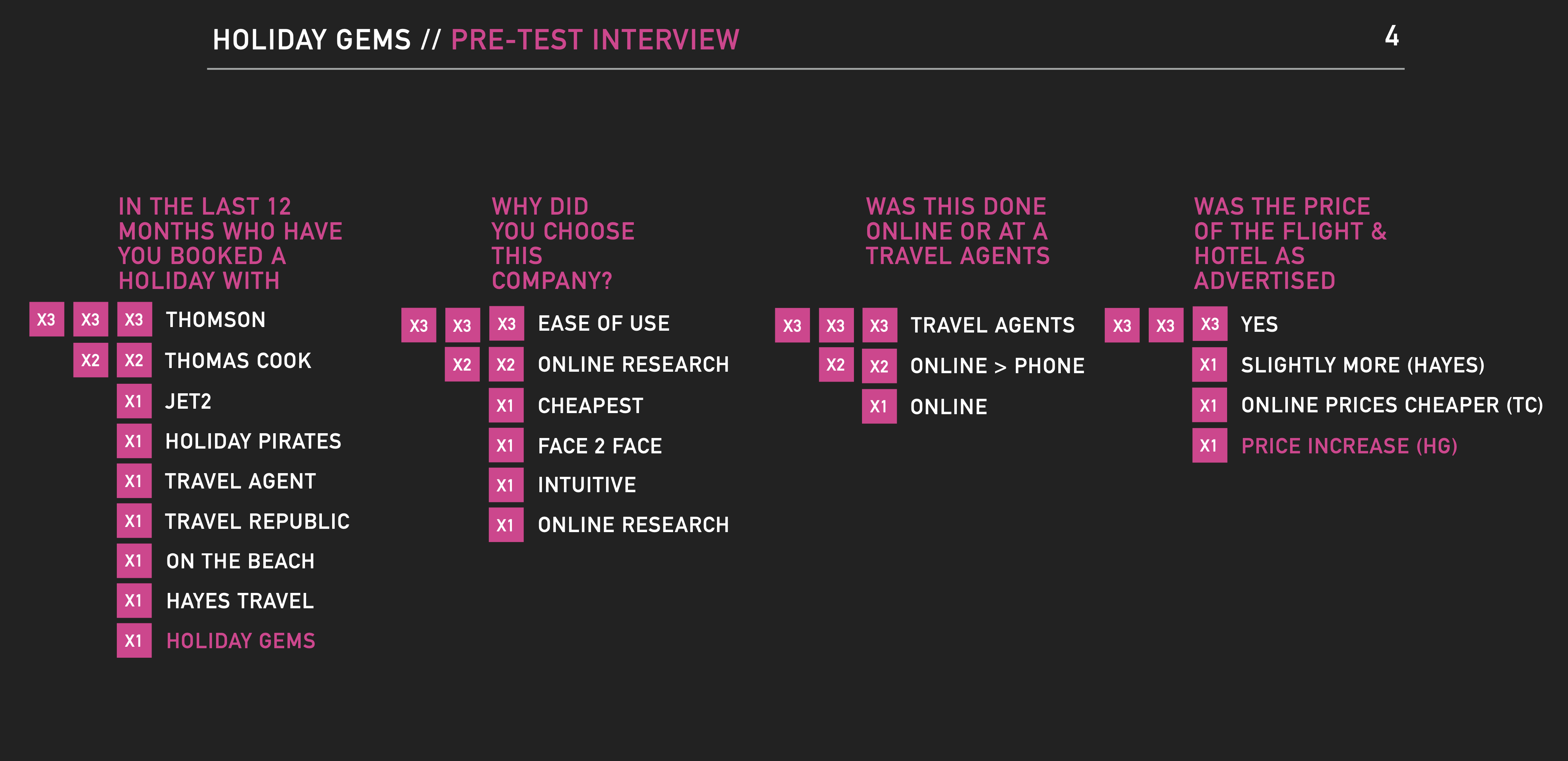
I conducted a multi-layered serviceUser ResearchUnderstand user behaviour, validate ideas, and make clearer product decisions with evidence you can act on.Open service programme combining guideUsability TestingObserving users complete tasks to identify usability issues, friction, and barriers to success.Open guide, eye tracking, glossaryHeuristicA heuristic is a general rule or principle used to guide decision making.Open glossary term analysis, competitor benchmarking and data analysis.
Testing was carried out in a controlled glossaryEnvironmentA specific setup where software runs, such as development, staging, or production.Open glossary term designed to replicate real-world glossaryBehaviourBehaviour refers to how users interact with a system, including actions, patterns, and responses.Open glossary term, with a mix of new and returning users across different travel needs.
guideUser InterviewsDirect conversations with users to understand behaviours, needs and motivations.Open guide explored expectations, decision-making and glossaryTrustUser confidence that a product, service, or organisation will do what it promises.Open glossary term factors. Eye tracking showed where attention was focused and, more importantly, where it wasn’t.
glossaryHeuristicA heuristic is a general rule or principle used to guide decision making.Open glossary term analysis and competitor reviews provided glossaryContextThe surrounding conditions that shape behaviour and decisions.Open glossary term, highlighting where Holiday Gems fell short and where others were setting better expectations.
This combination made it possible to move beyond surface issues and identify the glossaryRoot CauseThe underlying reason a problem exists.Open glossary term of poor glossaryConversionA conversion is any action a user takes that aligns with a defined goal, such as making a purchase, signing up, or completing a task.Open glossary term.
Key decisions
Fix clarity and trust before anything else.
A key decision was to prioritise glossaryClarityClarity is how easily users can understand what is happening and what they need to do.Open glossary term over adding more glossaryFeatureA feature is a specific piece of functionality within a product that delivers value to users. It represents something users can do or experience as part of the overall product.Open glossary term or content.
The core issue wasn’t a lack of functionality. It was a lack of glossaryConfidenceConfidence is the level of certainty in a decision or outcome based on available evidence.Open glossary term.
Users needed to understand what they were booking, how much it would cost, and what was included, without having to glossarySearchSearch is the functionality that allows users to find content or information by entering queries. It relies on indexing, metadata, and relevance algorithms to return useful results.Open glossary term for it.
That meant simplifying the experience, not adding to it. Reducing glossaryCognitive LoadCognitive load is the amount of mental effort required for a user to understand and interact with a product. High cognitive load makes tasks harder, slower, and more error-prone.Open glossary term, surfacing key information earlier, and removing anything that distracted from decision-making.
Another important decision was to align improvements with both user needs and business goals. Increasing transparency and serviceAccessibilityFind accessibility issues early, improve usability, and build products that are more inclusive, usable, and compliant.Open service wasn’t just better for users, it directly supported glossaryConversionA conversion is any action a user takes that aligns with a defined goal, such as making a purchase, signing up, or completing a task.Open glossary term and reduced reliance on customer support.
Solution
A clearer, more transparent booking experience.
The booking journey was restructured to support how users actually make decisions.
Key information such as flight details, baggage and pricing was surfaced earlier, reducing uncertainty and the need for users to glossarySearchSearch is the functionality that allows users to find content or information by entering queries. It relies on indexing, metadata, and relevance algorithms to return useful results.Open glossary term elsewhere.
Pricing was made more transparent, with clearer breakdowns introduced earlier in the journey to rebuild glossaryTrustUser confidence that a product, service, or organisation will do what it promises.Open glossary term and reduce glossaryDrop-offDrop-off refers to users leaving a journey before completing a desired action or reaching the next step.Open glossary term.
glossaryContent HierarchyContent hierarchy is the prioritisation and ordering of information to guide users through content in a clear and meaningful way. It determines what users see first, what stands out, and how information is consumed.Open glossary term was improved to prioritise what mattered most, making pages easier to scan and reducing visual clutter.
serviceAccessibilityFind accessibility issues early, improve usability, and build products that are more inclusive, usable, and compliant.Open service improvements ensured content was easier to read and navigate, supporting a wider range of users.
The result was an experience that answered questions before users had to ask them.
Experience map
A closer look at the work in context.
Gallery image from the Holiday Gems case study.
01/03
Outcomes
Higher confidence, higher conversion, lower friction.
glossaryConversion RateConversion rate is the percentage of users who complete a desired action compared to the total number of users.Open glossary term improved as users were able to complete bookings with more glossaryConfidenceConfidence is the level of certainty in a decision or outcome based on available evidence.Open glossary term.
serviceAccessibilityFind accessibility issues early, improve usability, and build products that are more inclusive, usable, and compliant.Open service improvements made the site more usable for a wider audience, supporting both compliance and glossaryPerformancePerformance refers to how quickly and efficiently a system responds to user actions and processes tasks.Open glossary term.
Customer support enquiries reduced, as users no longer needed to leave the journey to find answers.
The business gained a clearer understanding of how it compared to competitors, and where to focus future glossaryOptimisationOptimisation is the process of improving a product or journey to increase performance, usability, or conversion.Open glossary term efforts.
Most importantly, the experience moved from one that created doubt to one that supported decision-making.
Reflection
If users have to work, they won’t convert.
This project reinforced that glossaryConversionA conversion is any action a user takes that aligns with a defined goal, such as making a purchase, signing up, or completing a task.Open glossary term problems are rarely about glossaryTrafficTraffic refers to the number of users visiting a website, app, or digital product over a given period.Open glossary term.
They’re about glossaryClarityClarity is how easily users can understand what is happening and what they need to do.Open glossary term, glossaryTrustUser confidence that a product, service, or organisation will do what it promises.Open glossary term and effort.
If users have to glossarySearchSearch is the functionality that allows users to find content or information by entering queries. It relies on indexing, metadata, and relevance algorithms to return useful results.Open glossary term for information, question pricing, or second-guess their decisions, they hesitate. And hesitation glossaryLeadA lead is a potential customer who has shown interest in a product or service, typically by providing contact information or engaging with content.Open glossary term to glossaryDrop-offDrop-off refers to users leaving a journey before completing a desired action or reaching the next step.Open glossary term.
The role of UX in these situations is simple. Remove doubt. Reduce effort. Make the next step obvious.
Get that right, and glossaryConversionA conversion is any action a user takes that aligns with a defined goal, such as making a purchase, signing up, or completing a task.Open glossary term follows.