View of the sea and a beach

Holiday Gems: Optimising Conversion & Usability for a Competitive Travel Market

Lead User Researcher

Introduction

The travel industry is one of the most competitive digital markets, where small usability issues can lead to lost bookings. Holiday Gems, a low-cost holiday provider in the North West of the UK, had strong traffic from an SEO-driven strategy, but their conversion rates weren’t meeting expectations.

I was brought in to diagnose the issues and implement a structured optimisation strategy. Through user testing, eye tracking, competitor analysis, heuristic evaluations, and data analysis, I aimed to uncover where users were struggling, why they weren’t converting, and how the experience could be improved.

By personally conducting user interviews, competitor research, and stakeholder investigations, I delivered insights that led to higher conversion rates, improved accessibility compliance, enhanced usability, and a reduction in customer support inquiries.

Holiday Gems had high site traffic but poor conversion rates.
My role was to analyse the current offering, benchmark against competitors, and suggest changes.
A data-driven approach uncovered usability barriers and provided actionable recommendations.
The optimisation focused on conversion, accessibility, usability, and reducing customer support reliance.
“In travel, competition is fierce. If your booking experience isn’t seamless, potential customers will go elsewhere. Every click matters.”

Understanding the Problem: Research & Analysis

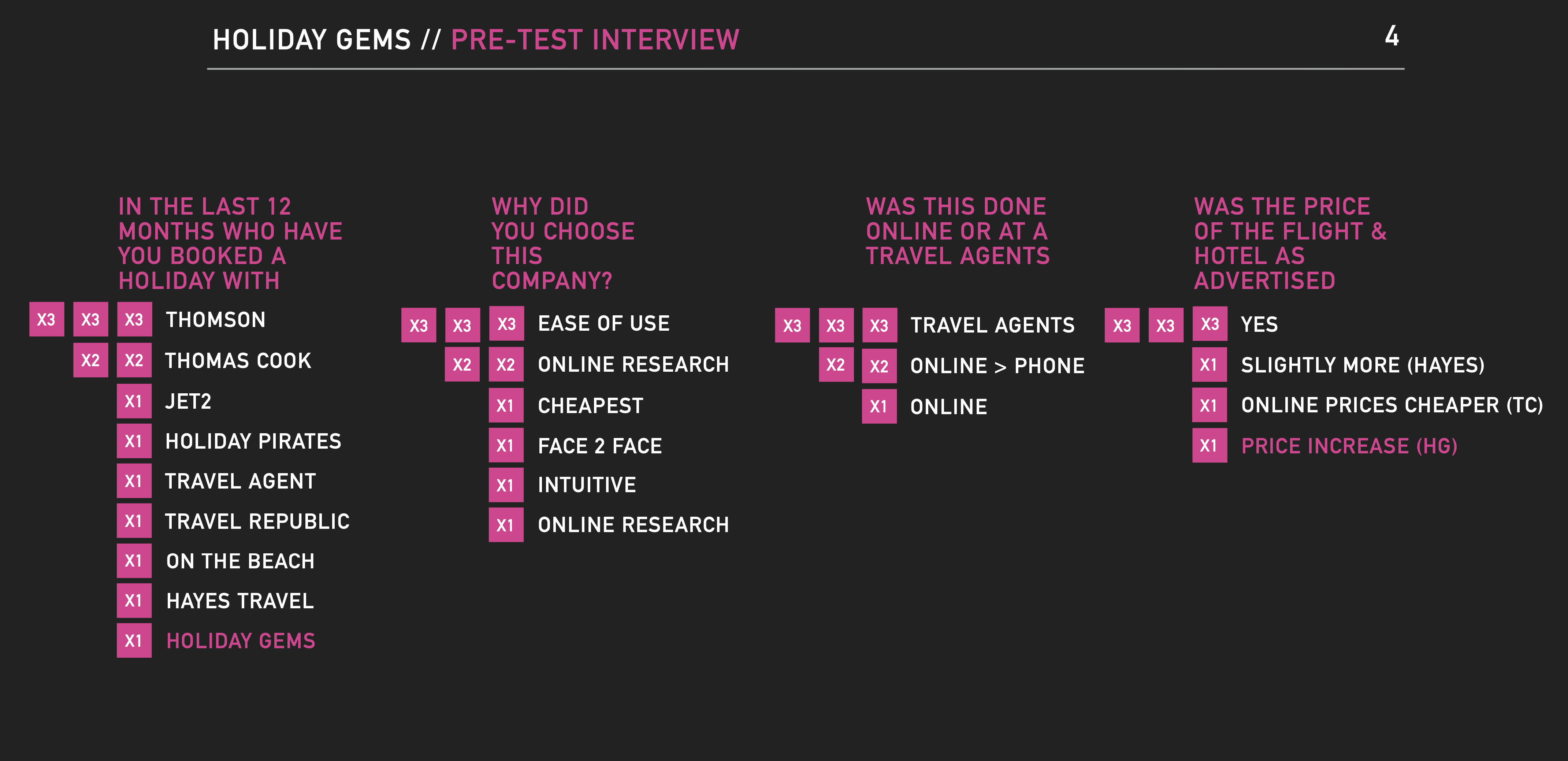
To pinpoint why users weren’t converting, I conducted a multi-layered research process, ensuring all findings were based on real user behaviour, not assumptions.

Testing was conducted at Tecmark offices, where participants were placed in a home environment to reflect real-world conditions. A mix of new and returning users were observed across three days, covering different family structures and travel preferences.

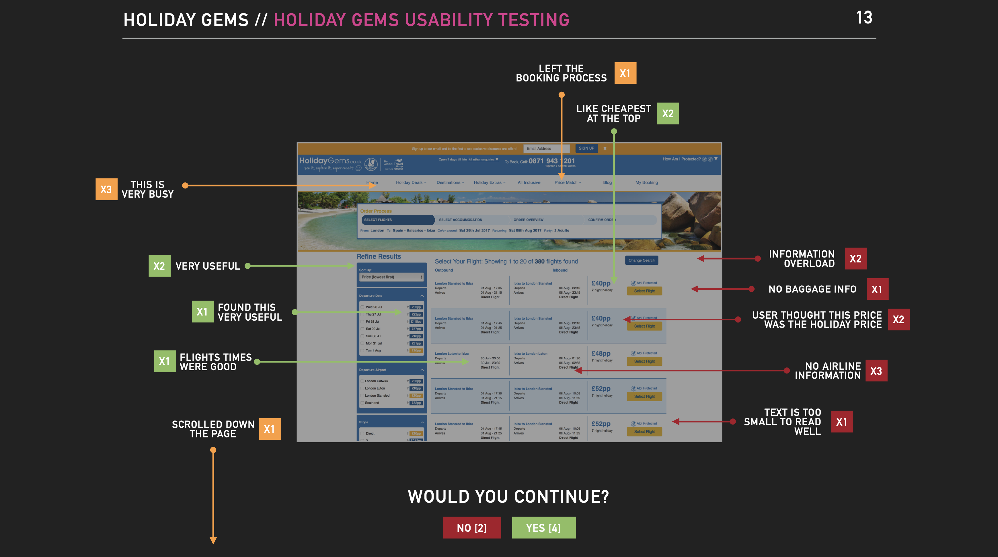
Findings from usability testing, eye tracking, and post-interviews revealed critical issues:

Pricing transparency was a major barrier—Users felt misled by costs that increased later in the booking process.
Navigation was frustrating—Many struggled to find key details such as flight carriers, baggage information, and flexible options.
Visual clutter distracted users from making a decision—Key CTAs were either missed or ignored, leading to hesitation.
Accessibility issues impacted usability—Some users found the text too small, struggled with contrast, and had difficulty scanning the information-heavy pages.
Important booking details were missing or difficult to find.

To identify the root causes of low conversion, I conducted a comprehensive research and analysis process, ensuring that findings were based on real user behaviour, not assumptions.

This included:

“If customers are leaving to find information elsewhere, we’re not just failing them—we’re losing them.”
Findings from User Research
Image: Pre Test Interview Results
Competitor Analysis
Image: Homepage Competitor Analysis
Findings overlay on a screenshot from User Research
Image: Homepage Analysis

Enhancing the Booking Experience

Armed with these insights, I developed a clear strategy to improve the user experience and increase conversion rates while balancing business priorities and technical feasibility.

Navigation & Information Hierarchy

One of the biggest frustrations users faced was finding essential details like baggage allowances, airline carriers, and total package prices. To address this:

Flight carrier information was added earlier in the booking process, reducing uncertainty.
Baggage fees were made clearer, ensuring users weren’t surprised at checkout.
Key details were prioritised visually, reducing cognitive load.

Improving Pricing Transparency & Trust

Users frequently abandoned bookings due to unexpected price increases at later stages. To rebuild trust:

A full cost breakdown was introduced earlier, reducing uncertainty.
More prominent ATOL protection messaging reassured users of financial security.
Clearer refund and cancellation policies helped users feel more confident.
“A well-designed website should answer users’ questions before they even think to ask them.”

Results & Impact

Following these optimisations, Holiday Gems saw measurable improvements:

Higher conversion rates, as users could now complete bookings more confidently.
Improved accessibility compliance, ensuring inclusivity for all customers.
Fewer customer support inquiries, lowering operational strain and costs.
A more user-friendly booking experience, increasing overall satisfaction.

The client was highly satisfied, now equipped with clear data-driven insights on where they stood against competitors and what changes drove the biggest impact.

“A successful travel site isn’t just about getting traffic—it’s about making every visitor count. The right experience turns visitors into customers.”

Final Thoughts & Lessons Learned

This project reinforced several key lessons about conversion rate optimisation and UX improvements:

Clarity builds confidence—users won’t book if they feel unsure about pricing, policies, or details.
Accessibility isn’t just ethical—it’s good business—an inclusive site increases bookings.
Reducing call centre reliance improves efficiency—better self-service options save costs.
User testing reveals what analytics alone can’t—real customer feedback is invaluable.
“Great UX is invisible—when the experience just works, users book with confidence.”

Let's Work Together

If you need to optimise conversions, improve accessibility, or refine your user experience strategy, let’s chat.