
Barclays had successfully positioned itself as a leader in digital banking, surpassing First Direct in innovation and user adoption. This success had been driven by an external digital agency known for cutting-edge design, but as competition intensified, Barclays made a strategic decision: bring all design and development in-house to reduce costs, improve collaboration, and maintain full control over digital products.
This transition was not without challenges. The Knutsford office had no existing design department, yet it had to immediately take over all digital product design. Meanwhile, competitors were rapidly innovating, and major disruptions from Apple and Android were on the horizon. There could be no slowdown in new feature releases, meaning the transition needed to be seamless.
I was brought in to lead this transformation from the ground up. My role was to engage with the outgoing agency, establish a high-functioning in-house design team, and embed an agile, research-driven approach to digital banking. At the same time, I worked on critical UX improvements to Pingit, Barclays’ flagship payments app, tackling complex security considerations, regulatory requirements, and usability challenges.
Building a design team from scratch inside a financial institution required careful planning, strategic execution, and cultural change. Barclays had relied entirely on an external agency, meaning there were no established design processes, tools, or collaboration methods in Knutsford. The biggest challenge was balancing the need for rapid growth with the high curve of knowledge transfer, ensuring that critical expertise wasn’t lost in the transition.
To prevent disruptions, I worked closely with both the agency and Barclays’ Canary Wharf design team, extracting key methodologies, documentation, and best practices. I introduced the Double Diamond framework as the foundation for the new design team, ensuring a structured yet flexible approach to problem-solving, research, and iterative design.
One of my key focuses was integrating design into Barclays’ agile development framework. At the time, there was a disconnect between designers and developers, which risked slowing down the pace of innovation. By embedding the design team within the agile process and ensuring daily collaboration with developers, we created an environment where design and engineering worked seamlessly together.
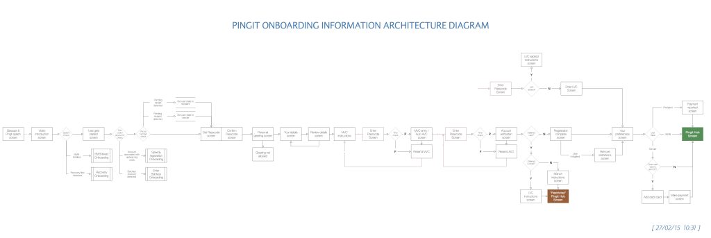
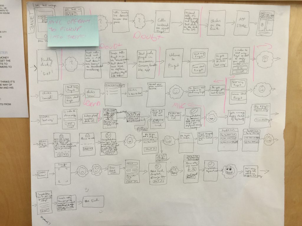
One of the first areas identified for improvement was Pingit’s onboarding process. While the app was gaining users, too many people were abandoning sign-up due to friction in the process. In fintech, onboarding is a make-or-break moment—a frustrating experience means losing users before they ever get started.
Through in-lab usability testing and analytics, I identified the biggest issues:
By redesigning the onboarding journey, I reduced the number of steps while still meeting strict banking regulations and security protocols. The final experience was faster, clearer, and easier to complete, leading to a higher activation rate and improved customer satisfaction.

Improving Pingit’s core experience wasn’t just about usability—it required navigating complex financial regulations and security requirements. Unlike consumer apps, every decision in banking UX has to account for fraud prevention, data protection, and legal compliance.
A key challenge was ensuring that new features improved usability without creating new vulnerabilities. For example, Pingit’s payment flow had to be seamless while preventing bad actors from exploiting loopholes. Every decision had to pass rigorous legal reviews, security audits, and in-depth testing.
To ensure all updates met user needs and compliance requirements, I ran:
One of the biggest internal challenges came when a new design principle suggested aligning Pingit’s iOS design language with Android. While consistency was important, iOS and Android have fundamentally different design patterns, and I knew that forcing Android conventions onto iOS would create a broken experience.
I pushed back on the change and proposed a user testing approach to validate the decision. After testing, the results confirmed my hypothesis—iOS users expected interactions aligned with Apple’s Human Interface Guidelines, and moving to an Android-inspired design led to confusion. The decision was made to return to a platform-native experience, ensuring that users on both systems got the best possible design.
This project reinforced key lessons about scaling design within a complex, regulated industry.
If you’re looking to transform your digital experience and create a smarter, more intuitive platform for your customers, let’s chat.